
Visual Vocabulary 101: Make Your Brand Look as Cool as It Sounds
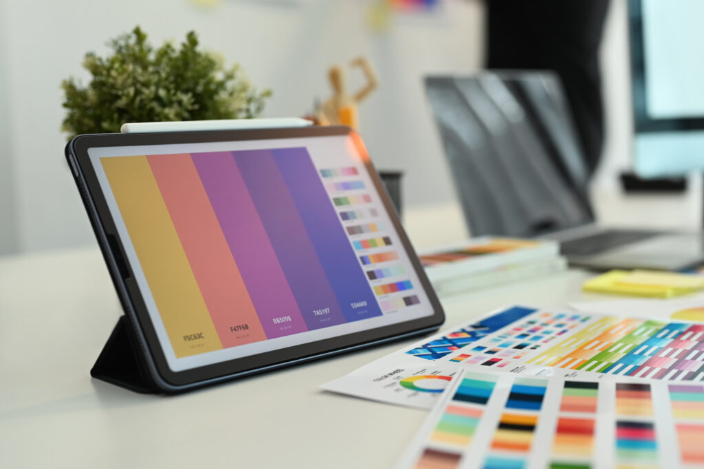
Let’s kick things off with a little branding magic trick, shall we? Imagine scrolling through Instagram, and BAM—there’s a post, and you know exactly which brand it is without even seeing the logo. That, my friend, is the power of a solid visual vocabulary. It’s like your brand’s personal style guide but cooler and way more fun. Think of it as the secret sauce that makes your brand instantly recognizable, like spotting your bestie in a crowd just by their walk.
So, what’s in this magical visual vocabulary, you ask? Oh, just a mix of things like colors, fonts, imagery, and those tiny details that give your brand its vibe. It’s basically your brand’s look and feel, wrapped up in a neat little package. And the best part? It speaks volumes without saying a word.
But here’s the deal: visual vocabulary isn’t about throwing random visuals together and hoping for the best. Nope. It’s about creating a visual language that feels as authentic as that oversized hoodie you never want to take off. Everything—from the shade of blue in your logo to the way your graphics are laid out—needs to work together like a killer playlist. When done right, it’s the thing that makes people stop, stare, and think, “Oh yeah, that’s totally them.”
So, grab your creative cap—we’re about to give your brand the glow-up it deserves.
Understanding Brand Identity
Before we dive headfirst into visuals, let’s chat about brand identity—aka your brand’s vibe, soul, and personality all rolled into one.
It’s like the DNA of your brand, the thing that makes you, well, you. Picture it as the behind-the-scenes blueprint for everything your brand does. Are you the fun, quirky type that shows up to brunch in mismatched socks, or are you more the sleek, polished friend who always has a latte in one hand and a planner in the other? Your brand identity decides that.
Now, here’s the kicker—your visuals need to match that vibe like peanut butter matches jelly. If your brand’s personality screams bold and fearless, then your visuals better not look like they were borrowed from the “meh” aisle. Think colors, fonts, graphics—all of it working together to tell your story without you having to say a word. And yes, this goes deeper than just aesthetics; it’s about the feels. The kind of feels that make someone scroll past and instantly go, “Wait, hold up, I know this brand!”
So, whether your brand is a chill minimalist or a neon-loving maximalist, your visual game needs to deliver that same energy. It’s all about staying true to who your brand is and letting the visuals do the talking—like a perfectly curated first impression that sticks.
Creating a Consistent Color Palette
Let’s talk colors—because, honestly, they’re the real MVPs of your brand’s vibe.
Think about it: ever notice how certain brands just *own* a color? Like, you see that particular red and instantly crave fries or that swooshy checkmark in a bold black and suddenly feel like going for a run. That’s the magic of a killer color palette.
Now, your job is to pick a handful of hues that scream *you*—not literally scream, though, unless your brand’s into chaos (no judgment). Start with your main color, the Beyoncé of your palette, and then add some backup singers to harmonize. Throw in an accent color or two to keep things spicy, but don’t go wild like you’re painting a toddler’s playroom. Less is more, trust me.
Oh, and don’t just slap random colors together because they’re “pretty.” Make sure they actually play nice together. Think complementary, not clashing. Use tools like color wheels or online palette generators if you’re feeling stuck. Once you’ve got your dream team of shades, commit to them like it’s a Netflix binge—you want these colors showing up everywhere. Website, social posts, packaging—you name it, they’re there, working hard to keep your brand unforgettable.
Selecting the Right Typography
Ah fonts—because the wrong one can make your brand look like it’s still stuck in a 2003 PowerPoint presentation.
Picking the right typography is basically like picking an outfit for your words. You wouldn’t show up to a wedding in sweatpants, right? Same deal here. Your fonts need to dress the part and match your brand’s vibe perfectly.
Here’s the deal: every font has its own personality. Some are sleek and modern, like that friend who always knows the latest trends, while others are more old-school and classic, like a handwritten thank-you note from grandma. So, if your brand’s all about fun and whimsy, don’t roll up with stiff, corporate-looking fonts that scream “tax season.” On the flip side, if your brand’s all business, maybe skip the playful, bubble-letter vibes.
And mixing fonts? Oh, it’s an art form. You can’t just throw three random ones together and hope for the best. Pair a bold headline font with a clean, readable one for body text. Think yin and yang, not font chaos. Tools like Google Fonts or Adobe Fonts are lifesavers when you’re trying to find the perfect match.
Pro tip: keep it simple and stick to two or three fonts max. Anything more, and it’s like inviting too many people to your group chat—confusing and overwhelming.
Incorporating Imagery and Graphics
Now onto pictures and graphics—the eye candy of your brand’s visual vocabulary. These babies do more than just make things look pretty; they tell your story without you having to type out a single word. Think of them as your brand’s hype squad, silently cheering, “Look at us, we’re awesome!”
Now, here’s the deal: your imagery and graphics need to vibe with your brand’s personality. If you’re all about chill minimalism, don’t slap neon fireworks on everything. And if your brand’s more bold and spicy, skip the sad, washed-out stock photos. Basically, your visuals should feel like they belong at the same party as the rest of your branding.
Oh, and don’t underestimate the power of consistency here. If you’re using photos, keep a similar style—like a filter that ties everything together (but, ya know, not the kind that screams “I just discovered Instagram in 2012”). For graphics, make sure they flow with your color palette and typography.
And let’s not forget quality. Blurry photos or low-res graphics? Big nope. Invest in good images or work with a designer who gets your brand’s vibe. Your visuals are like your brand’s handshake—make it firm, not floppy.
Developing Unique Iconography
Time to get into the tiny-but-mighty world of icons.
These little guys might seem like the sidekicks of your brand’s visual vocabulary, but trust me, they’re more like the unsung heroes. A well-designed icon can say a thousand words without breaking a sweat—it’s like the ninja of branding. Think of them as your brand’s shorthand, those quick, snappy visuals that people instantly associate with you.
But here’s the thing: not just any old icon will do. Generic clip art? Hard pass. Your icons should feel like they belong exclusively to your brand, like they rolled out of your own personal icon factory. The key is to design them in a way that aligns with your overall vibe—sleek, playful, bold, minimal, whatever your brand’s personality is rocking.
Oh, and keep them consistent. If you’re using sharp lines and geometric shapes for one icon, don’t suddenly toss in a bubbly, hand-drawn look for another. It’s all about creating a cohesive squad of icons that look like they belong to the same family, not some random assortment from a free download site.
Pro tip: use these icons everywhere—on your website, social media, packaging, emails—you name it. Done right, they’ll become little breadcrumbs that lead people straight back to your brand. And honestly, who doesn’t want their own breadcrumb trail of awesomeness?
Maintaining and Evolving Your Visual Vocabulary
So you’ve got your visual vocabulary on point—high fives all around!
But here’s the thing: branding isn’t a “set it and forget it” kind of deal. Nope, your visual game needs to grow and flex just like your Spotify playlist (because let’s be honest, the same five songs will only get you so far).
As your brand evolves—whether you’re launching new products, targeting a fresh audience, or hopping on the next big trend—it’s important to check in with your visuals. Are your colors still vibing? Do your fonts still feel fresh? Maybe your icons need a glow-up. Whatever it is, don’t be afraid to make some tweaks. Think of it like redecorating your living room—you’re still *you*, just with a little extra flair.
That said, don’t go changing things every five minutes. Consistency is key, so any updates should feel like a natural progression, not a total identity crisis. And always keep your audience in mind. If they’re digging your bold, playful style, don’t suddenly pivot to “serious corporate energy” without a good reason.
Bottom line: keep your visuals fresh but true to who you are. Because when your brand looks good, it feels good—and your audience will totally notice.
Selling a property? Give us a call today and learn more about our professional photography services that can boost your property listing!
Also, explore our sister company for exclusive luxury listings you won’t want to miss. Don’t forget to tune into our new podcast for even more valuable insights!