
Lights, Camera, Bold Color! Real Estate Photos That Pop
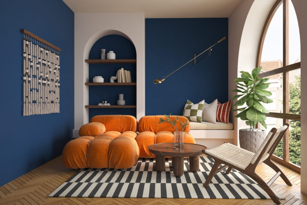
Let’s talk bold colors—because nothing screams “look at me!” like a bright red door or a vibrant teal accent wall.
When it comes to real estate photography, bold colors are your secret sauce for creating scroll-stopping photos. They bring personality, energy, and just the right amount of wow-factor to a space. And let’s be honest, no one remembers the beige house they saw online, right? Bold colors give a property character, and that’s what gets people clicking.
Now, I know what you’re thinking: “But what if the colors are too bold?” That’s the beauty of photography—you get to control how those colors come across. Whether it’s a punchy orange backsplash in the kitchen or an emerald green sofa in the living room, your job is to showcase those colors in their best light. Literally.
And don’t stress if you’re not naturally drawn to bold palettes in your everyday life—this isn’t about turning every home into a technicolor dream. It’s about finding those standout moments in a space and giving them their time to shine. Bold colors are like the exclamation points of interior design; use them to grab attention and make your photos memorable. Ready to dive into the world of unapologetically vibrant hues? Let’s do this!
Understanding Color Theory
Think of it as the cheat code for making bold colors look their absolute best in your photos. You know how some rooms just work visually? That’s no accident, my friend—it’s all about how colors interact.
So here’s the deal: colors can play nice with each other, or they can clash harder than your favorite band’s reunion tour outfits. Complementary colors are where the magic happens. They’re opposites on the color wheel, like blue and orange or red and green. When you pair them up in a photo, it creates this eye-popping contrast that makes your shot feel balanced and alive. Think about a lime green chair against a deep purple wall—it just hits, doesn’t it?
And here’s a fun fact for your next trivia night: color can influence emotions and behavior, though more research is still needed in this field?. Basically, those warm, sunny yellows can make a space feel inviting, while cooler tones like blues and teals bring a chill vibe. Use that knowledge like a superpower to shape the mood of your photos.
At the end of the day, mastering color theory is like being a DJ for the eyes. You’re mixing hues to create a visual track that makes people stop and say, “Whoa, that’s amazing!”
Choosing the Right Equipment
Allow us to geek out about gear for a sec—because getting those bold colors to pop takes more than just pointing your phone and hoping for the best.
First up, you’re gonna want a DSLR or mirrorless camera with a solid sensor. Think of the sensor like your color sponge—it soaks up all those vibrant reds, blues, and greens and makes them look as eye-catching as they do in real life. And let’s not forget lenses! A lens with good color rendition is like the cherry on top. It helps keep your colors true and crisp without turning your photo into a muddy mess.
Now, filters? Oh, they’re not just for Instagram. A polarizing filter is your new BFF—it cuts down on pesky reflections and boosts saturation, making those bold hues really pop. And lighting? Don’t even get me started on how important it is. Natural light is usually the MVP, but an external flash or two can swoop in to save the day when shadows try to crash the party.
Also, pro tip: don’t overlook a sturdy tripod. Nobody wants their masterpiece ruined by shaky hands! Whether you’re snapping that lime green couch or a fiery orange front door, the right equipment is like your backstage crew, making sure everything looks flawless.
Techniques for Capturing Bold Colors
Time to get down to the nitty-gritty of making bold colors pop like they’re the star of the show—because they are.
First things first, lighting is your best friend here. If you can, aim for that golden hour glow—it’s like nature’s built-in Instagram filter. That warm, soft light is going to make those colors sing. And angles? Oh, they matter. Move around, crouch down, climb up a step stool if you have to (just don’t fall—we need you alive for this). The idea is to find that sweet spot where the light hits just right, making those bold hues go, “Ta-da!”
Now, let’s talk about composition. You know those leading lines you learned about in photography 101? Yeah, dust those off. Use them to guide the viewer’s eyes straight to that fiery red wall or cobalt blue sofa. Bold colors love to be the center of attention, so give them their moment in the spotlight. Oh, and don’t forget about texture. If that vivid orange wall has a cool stucco finish or that electric green chair is velvet, get up close and personal to show it off.
Finally, don’t be afraid to experiment. Play with reflections, backdrops, or even throw in a prop that complements the bold color. It’s all about letting your creativity run wild and having fun with it. Go ahead, break the rules—bold colors thrive on a little rebellion!
Post-Processing for Enhanced Colors
So you’ve got your bold color shots, but sometimes the camera doesn’t quite capture the magic your eyes see.
That’s where post-processing swoops in like a superhero with a Photoshop cape. First things first, fire up Adobe Lightroom or Photoshop—whatever floats your editing boat—and let’s get tweaking. Start with the basics: bump up the vibrance a bit to give those colors some extra oomph, but don’t go wild and turn everything into a neon nightmare. Saturation? Handle with care, my friend. A little goes a long way here, or you’ll end up with a photo that looks like it’s auditioning for a cartoon.
Now, here’s a pro move: use selective adjustments to really make those bold colors pop. Got a sky that’s looking a little meh? Pull up the blues. That orange couch not as fiery as you remember? Crank it up—but gently. Play around with the HSL sliders (Hue, Saturation, and Luminance) to tweak individual colors without wrecking the whole vibe. And hey, don’t forget about shadows and highlights—they can make or break the depth of your colors.
Oh, and if you’re feeling fancy, experiment with a touch of split toning to add warmth or coolness to your image. It’s like seasoning your photo—just the right pinch can take it from bland to bold perfection.
Showcasing Your Work
So you’ve got those jaw-dropping, bold color shots, and now it’s time to let the world bask in your creative genius.
First stop? Social media. Instagram is basically your digital gallery, so treat it like one. Curate your feed with a mix of your brightest, most vibrant shots—because nothing stops a scroll like a pop of neon pink or a fiery red wall. And don’t just post and ghost. Engage! Respond to comments, slide into some DMs (professionally, of course), and join photography communities. It’s like networking, but way more fun.
Pinterest is another goldmine for photographers. People go there for inspiration, so why not be the one inspiring them? Create boards with your work, use all the buzzworthy hashtags, and watch the repins roll in. And hey, if you’re feeling bold (pun intended), take your talents to TikTok. Show off some behind-the-scenes moments, time-lapse edits, or even quick tips for photographing bold colors. People love seeing the process almost as much as the final product.
And don’t forget your website or portfolio! Keep it clean, professional, and loaded with your best shots. Think of it as your visual résumé—potential clients should be wowed within seconds. Basically, anywhere you can show off those unapologetically vibrant hues, do it. Loud and proud, my friend!
Conclusion
Photographing bold colors is a bit like hosting a party. You’ve got to set the mood, make sure everyone’s looking their best, and capture the magic while it’s happening.
Sure, there’s some science and gear involved (shoutout to color theory and that trusty tripod), but at the end of the day, it’s all about trusting your gut and having fun with it. Bold colors are meant to stand out, so don’t shy away from them—embrace the drama, the energy, the wow-factor!
And hey, don’t stress if every shot isn’t perfect. This is all part of the process. Experiment, try new angles, play with lighting—break a few “rules” if you feel like it. Some of your best photos will come from those happy little accidents where you just go for it.
So grab your camera, crank up your creativity, and let those bold colors do the talking. Whether it’s a flamingo-pink wall or an electric-blue armchair, you’ve got this. Now go make some magic happen and get those “oohs” and “aahs” rolling in!
Selling a property? Give us a call today and learn more about our professional photography services that can boost your property listing!
Also, explore our sister company for exclusive luxury listings you won’t want to miss. Don’t forget to tune into our new podcast for even more valuable insights!