Color Tricks to Make Your Property Photos Pop
Ever wondered why some property photos just grab your attention like a cat spotting a laser pointer? It’s all about color theory! When you’re snapping pics of houses or apartments, color tricks can turn a blah space into something that makes potential buyers go “Wow!”
Think of color theory as your secret sauce to make properties look inviting and memorable. From making rooms feel bigger to giving them a cozy vibe, colors can do a lot more than just look pretty. If you nail this, you could have buyers lining up to check out the place.
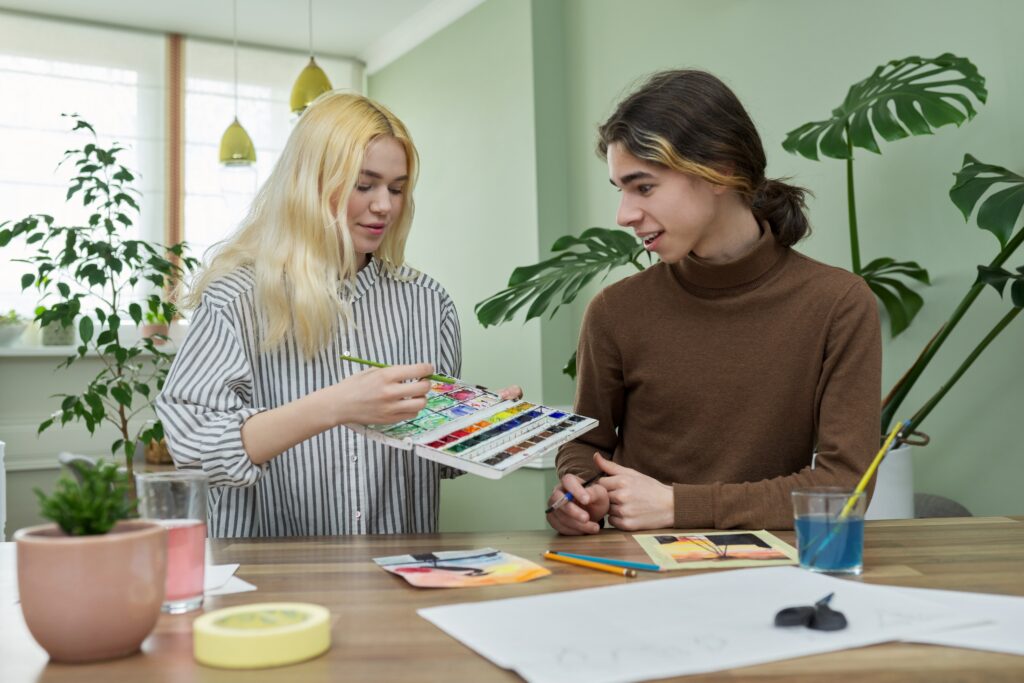
Here’s a little tease: ever notice how some photos just have that “perfect” feel? That’s usually because the colors are balanced and harmonious. And guess what? You don’t need to be an art school grad to pull this off. Just a basic understanding of the color wheel and how colors mix and match can make your photos pop.
So, next time you’re about to snap that shutter, think about how the colors in the room interact. A little tweak here and there with your color choices can make a world of difference. Trust me, it’s like having a magic wand for real estate photography!
Basic Principles of Color Theory
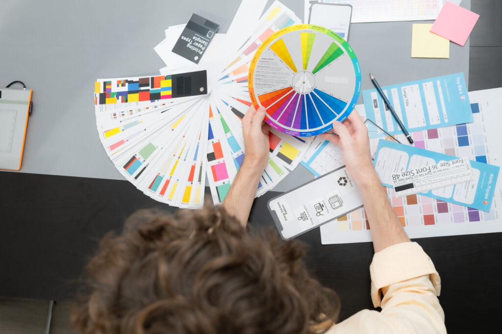
Let’s dive into the color wheel basics!
Picture this: the color wheel is like your ultimate cheat sheet. It’s got primary colors—red, blue, and yellow. Mix those bad boys, and you get secondary colors like green, orange, and purple. But wait, there’s more! Mix those secondary colors a bit, and you get those cool in-between hues known as tertiary colors.
Now, why should you care about this? Because understanding these relationships can turn your so-so property pics into absolute stunners. Imagine using complementary colors—those sitting opposite each other on the wheel. They create vibrant contrasts that can make a room pop in photos. Or go for analogous colors, which sit next to each other. They’re like best friends, creating a harmonious and pleasing look.
You don’t need to become a color scientist here. Just a basic grasp can help you decide, “Hmm, maybe this room needs a splash of orange to contrast that blue couch,” or “A little bit of yellow in this corner will brighten things up.” Trust me, once you get the hang of these basics, you’ll start seeing potential in every room you shoot. It’s like discovering a hidden superpower for your photography!
Impact of Color on Perception
Colors aren’t just there to look pretty; they’re playing tricks on our brains!
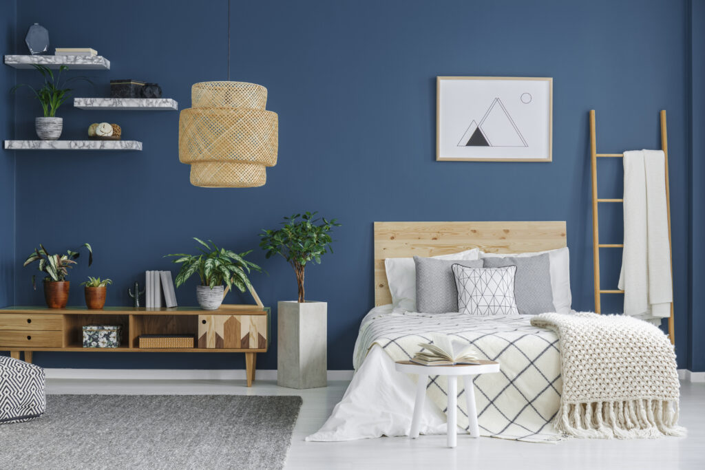
Each color can make us feel a certain way and even change how we see a space. Take blues and greens, for example—they’re like the chill-out crew, making rooms feel bigger and more relaxed. Reds and oranges, on the other hand, are like a warm hug, making spaces feel cozy and inviting.
And get this—well-balanced colors can actually make a property look pricier! According to the Journal of Real Estate Research, these properties can increase perceived value by up to 10%. So yeah, your choice of color can be a total game-changer.
Imagine this: you’ve got a small room that feels cramped. Throw in some cool colors, and suddenly it feels spacious. Or maybe you’ve got a big room that feels a bit too sterile—warm it up with some reds and oranges, and bam! It’s instantly cozier. The way colors mess with our perceptions can be your secret weapon in making any space look its best.
So next time you’re framing that perfect shot, think about what colors will bring out the best in the room. Trust me, it’s worth the effort!
Choosing the Right Colors for Different Rooms
Let’s have some fun with colors and rooms!
Kitchens and bathrooms love clean, bright colors. Think whites, light blues, and yellows. They bounce light around and make these spaces feel fresh and airy. Plus, who doesn’t want a kitchen that feels like a morning breeze?
Living rooms and bedrooms? They’re all about getting cozy. Picture earthy browns, soft grays, or muted greens. These shades wrap you up in a warm hug, perfect for Netflix marathons or lazy Sunday mornings. You know, those colors that just scream, “Come, chill here!”
For dining rooms, go a bit bold with deep reds or rich purples. They add a touch of elegance and make the space feel fancy without trying too hard. And if you’ve got a home office, light greens or blues can keep things calm and help you focus. They’re like the cool, collected friend who always has their act together.
Don’t forget those tiny nooks and crannies! Lighter colors can open up small spaces, making them feel bigger. So, whether you’re snapping pics of a sprawling living room or a snug little study, choosing the right color can make your photos pop. It’s all about setting the right vibe for each room and making every shot count!
Balancing Light and Color

So let’s talk about the magic combo: light and color.
Think of them as your dynamic duo, like Batman and Robin or peanut butter and jelly—they just work better together! Natural light is your BFF when it comes to making colors look their best. It’s like the Instagram filter of real life, making everything pop without looking fake.
But what happens when the sun takes a nap? That’s where artificial light swoops in to save the day. Warm lights go great with warm colors, and cool lights? You guessed it—they’re perfect for cooler shades. The trick is to balance the two so your photos don’t end up looking like they were taken in a cave or under a spotlight.
Get it right, and you’ll make those colors sing! So next time you’re setting up a shot, give a little thought to how light and color can team up to make your property pics shine. You’ll be snapping like a pro in no time!
Selling a property? Give us a call today and learn more about our professional photography services that can boost your property listing!
Also, explore our sister company for exclusive luxury listings you won’t want to miss. Don’t forget to tune into our new podcast for even more valuable insights!