
Stop Losing Clicks! Make Your CTAs More Effective
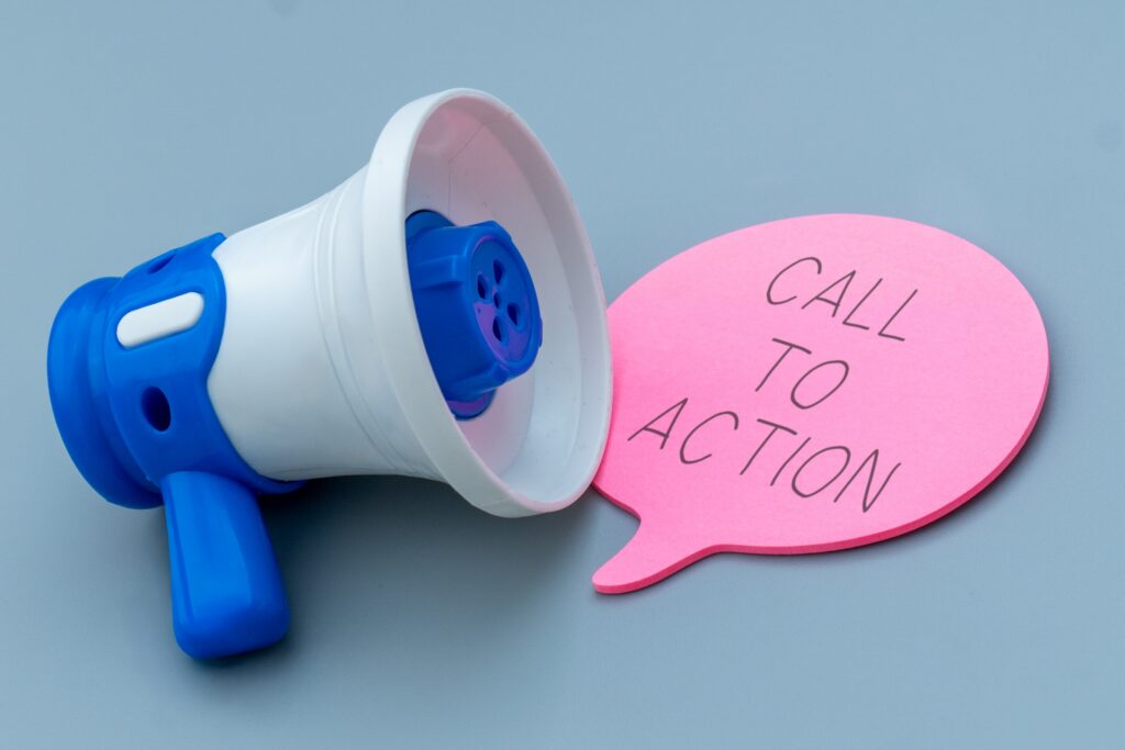
If your Calls-to-Action (CTAs) aren’t pulling their weight, your website might as well be a wallflower at the internet prom. CTAs are like the party starters of your page, the “Hey, over here!” that gets people to do the thing you want them to do. Whether it’s signing up for a newsletter, downloading a guide, or buying something shiny, your CTAs are the little nudges that make it happen. But here’s the deal: not all CTAs are created equal. Slapping a “Click Here” button on a page and calling it a day isn’t going to cut it. You’ve got to make them irresistible, more effective, like that last slice of pizza no one admits they want but everyone’s eyeing.
So, what’s the secret sauce? It’s all about making your CTAs stand out and connect with people in a way that feels natural. Think of them as an invitation, not a demand. You don’t want to come off like that overenthusiastic salesperson no one wants to talk to. Instead, create something that feels like, “Hey, this is totally for you, and it’s awesome!”
Oh, and don’t forget—it’s not just about what your CTA says, but how it looks, where it sits, and when it pops up. The goal? To turn casual browsers into action-takers without making it feel forced.
Understanding Your Audience
You can’t create a killer CTA if you don’t even know who you’re talking to.
Picture this: you’re at a party trying to impress someone, but you start rambling about your rare stamp collection to someone who clearly only cares about sports. Awkward, right? That’s basically what happens when you don’t understand your audience. You’ve got to do a little digging and figure out who they are, what they care about, and how they’re spending their time online.
Are they scrolling through your site while juggling their coffee and their kids? Or are they the type who reads every word like it’s the fine print on a legal document? These little details matter. The way you talk to a laid-back college student isn’t the same way you’d talk to a buttoned-up executive. And don’t even get me started on tone—keeping it too formal for a chill audience is like showing up in a tux to a backyard BBQ.
Once you get a handle on their vibe, you can start crafting CTAs that speak their language. If they’re all about no-nonsense efficiency, go for direct and simple. If they’re the fun-loving type, get playful! It’s all about making them feel like you *get* them, like you’re handing them exactly what they need on a silver platter.
Crafting Compelling CTAs
Let’s get down to business—your CTAs need to pack a punch.
The secret? Action verbs are your besties here. Use words that make people *want* to take action, like “Grab,” “Discover,” or “Join.” None of that weak “Learn More” stuff. You want your CTA to sound like the life of the party, not a boring lecture. Another tip? Give people a reason to act *now*. Sprinkle in phrases like “Only a Few Left” or “Offer Ends Tonight.” Seriously, nothing gets people clicking faster than a little FOMO.
And let’s not forget, simpler is better. A single, focused CTA can do wonders compared to a cluttered mess of options. In fact, Campaign Monitor found that emails with just one clear CTA can increase click-through rates by a whopping 371%. So, resist the urge to toss in everything but the kitchen sink. Keep it clean, clear, and direct.
Oh, and tone matters too! Match it to your audience. If they’re all business, keep it sharp and to the point. If they’re more laid-back, don’t be afraid to have a little fun with it. At the end of the day, your CTA is basically a personal invite to your audience—it should feel just right for them.
Design and Placement
Let’s talk about the makeover your CTAs deserve.
First off, design isn’t just about being pretty—it’s about catching eyeballs. Bold colors? Yes. Big, clear fonts? Absolutely. Think of your CTA like the neon sign in a sea of plain billboards. It needs to pop, not blend in. Shapes can also work wonders. A button that actually looks like a button? Revolutionary, right?
Now, placement is where strategy comes into play. You don’t just throw your CTA on the page and hope for the best—it’s got to land where people will actually notice it. For starters, keep it front and center when the moment feels right. Got a killer blog post? Drop a CTA right at the juicy part where your readers are fully engaged. And don’t sleep on those hot spots like the top of your page or the end of your content.
Oh, and mobile users? Don’t forget about them. If your CTA is hiding in some corner on a tiny screen, they’re not gonna find it. Make sure everything stays finger-friendly and easy to tap. The goal is simple: your CTA should be impossible to miss without being obnoxious. Think of it as the friend who knows how to get attention at a party—charming, but not over the top.
Testing and Analyzing CTAs
So you’ve got your shiny new CTAs live on your site—now comes the fun part: seeing what actually works.
This is where A/B testing steps in, like a reality TV host ready to crown a winner. It’s simple: you create two (or more) versions of your CTA and let them battle it out. Maybe one button says “Get Yours Now” and the other says “Claim Your Spot.” Or maybe one’s bright red, and the other’s a chill blue. Test one thing at a time so you know what’s making the magic happen.
Once those clicks start rolling in, it’s time to dive into the numbers. Pay attention to metrics like click-through rates and conversions—they’re the truth-tellers in this story. If one version’s getting all the love while the other’s collecting digital dust, you’ve got your answer. But don’t stop there! Keep tweaking and testing, because trends and preferences change faster than you can say “algorithm update.”
Oh, and pro tip: don’t get too attached to your first idea. Even if you think you’ve created the Mona Lisa of CTAs, the data might tell a different story. And hey, that’s fine! The beauty of testing is that you can always switch things up and try again. Think of it as your excuse to keep experimenting without judgment—after all, it’s for science!
Common Mistakes to Avoid
Let’s talk about what *not* to do with your CTAs because, let’s be honest, we’ve all had those “what was I thinking?” moments.
First mistake? Overloading your page with a gazillion CTAs. Seriously, nobody wants to feel like they’re in a carnival game where everything’s shouting “Pick me!” Keep it simple. One clear, focused CTA per page is usually the way to go.
Next up, bad timing. Ever clicked on a site and been hit with a pop-up before you’ve even had a chance to blink? Yeah, don’t be that guy. Let people settle in before you hit them with the ask. And then there’s the dreaded design fails. A dull, gray button that blends into the background? Nope. If your CTA doesn’t stand out visually, it’s like whispering at a rock concert—no one’s going to notice.
Oh, and here’s a classic: making the CTA too hard to find. If your button’s buried halfway down the page or hidden in a maze of text, good luck getting clicks. Same goes for CTAs that don’t work on mobile—pinching and zooming just to tap a button is a fast track to frustration.
Finally, don’t promise one thing and deliver another. A misleading CTA isn’t just annoying; it’s a one-way ticket to losing trust. Keep it real, folks!
Next Steps
You’ve made it to the end—gold star for you!
Now, it’s time to put all this CTA wisdom into action. Start by looking at the ones you’ve already got. Are they doing their job, or are they just kinda… there? Be honest with yourself, and don’t be afraid to shake things up. Maybe it’s a tweak to the wording, a pop of color, or moving that button to a spot where it actually gets some attention.
Next, don’t forget the golden rule: test, test, test. No one gets it perfect on the first try (and if they say they do, they’re lying). Keep experimenting, see what clicks—literally—and adjust as you go. Think of it like trying to make the perfect pancake. The first one’s always a little weird, but by the third or fourth, you’re a flipping pro.
And hey, don’t stop here. Stay curious and keep learning because the digital world isn’t slowing down anytime soon. Your audience’s habits, preferences, and even what makes them laugh can change faster than a trending meme. So, stay on your toes, have fun with it, and keep those CTAs fresh. You’ve got this—now go make some magic happen!
Selling a property? Give us a call today and learn more about our professional photography services that can boost your property listing!
Also, explore our sister company for exclusive luxury listings you won’t want to miss. Don’t forget to tune into our new podcast for even more valuable insights!